
Mobile-First Web Design: Why Your Business Website Must Work on Every Screen
A practical planning approach for designing around constrained screens and real tasks, then expanding thoughtfully for larger devices.
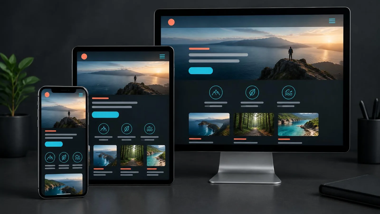
Mobile-First Web Design makes priorities explicit before a desktop layout gives the team room to add everything. Begin with the customer task and information required to complete it on a constrained screen, then expand thoughtfully for wider devices.
The process involves content order, adaptable layouts, accessible input and realistic performance checks. It is not simply shrinking a screenshot or ignoring desktop users. Plan the narrow experience around meaningful tasks, then test how those decisions behave across screens.
What mobile-first planning means
Mobile-first web design begins by deciding what people need to accomplish on a small screen, then progressively adapting the experience for wider screens. It is a planning method, not a claim that phones are the only important device. The goal is to make priorities explicit before additional space encourages teams to add content indiscriminately.
Starting with constraints brings content hierarchy, navigation, and action choices into focus. Teams must decide which information is essential, what can be summarized, and how people move between tasks. The same decisions improve clarity on desktop, even when the final layout is more expansive.
Understand the audience and context
Do not assume that every visitor is hurried or using a phone outdoors. Research the audience, the service, and the situations in which key tasks happen. A customer may be checking opening hours, researching a complex purchase at home, or returning to compare options. Each context can affect what should be immediately available.
Map the important tasks and identify information that supports them. For a local service, contact details and service coverage may be essential. For a professional service, process, fit, and ways to ask questions may matter more. Let evidence and business purpose shape the mobile priorities.
Prioritize content before styling
Create a content order for the narrow view: clear page purpose, essential explanation, primary action, and the information needed to make a decision. This does not mean hiding all secondary content. It means distinguishing essential content from material that can sit later in the page or be presented in a more compact format.
Use headings that make sections scannable and concise copy that preserves nuance. Do not remove pricing qualifications, safety information, or other important context simply to make a page shorter. A smaller screen calls for better organization, not less honesty.
Build layouts that adapt gracefully
Responsive website design uses flexible layouts, fluid media, and breakpoints chosen when the content needs them. Avoid designing for a short list of device models; screen sizes and orientations vary. Test where columns become cramped, navigation wraps, or text lines become difficult to read.
On wider screens, use added space to improve comparison or grouping, not to stretch paragraphs across an uncomfortable width. Ensure images retain useful cropping and tables have an accessible presentation. Check both portrait and landscape orientations where the task warrants it.
Design forms for real mobile input
Use the right input type for email, telephone, or numeric information so devices can offer an appropriate keyboard. Keep labels visible, make fields large enough to interact with, and explain formats only when needed. Avoid forcing a person to scroll back and forth to resolve an error.
Ask only for information needed at that stage. Break a genuinely complex process into clear steps with progress and a way to review answers, but do not add steps solely for visual neatness. Confirm completion and explain what the user can expect next.
Treat performance as part of mobile UX
A page can be visually responsive yet still feel unusable when it loads slowly or shifts unexpectedly. Serve appropriately sized images, reserve space for media, avoid unnecessary third-party scripts, and test the experience on realistic network conditions. Performance work should be based on measurement of the actual page.
Do not assume that a fast connection or recent device is universal. Keep essential content available if optional enhancements fail, and avoid loading large assets before they are needed. Responsive web development includes the behavior of the page, not just its breakpoints.
Test with tasks, not screenshots alone
Device emulators help identify layout problems, but they do not replace testing on physical devices and with real users. Ask someone to complete representative tasks: locate service coverage, compare options, submit an enquiry, or find a policy. Observe what is missed and where interaction feels awkward.
Check accessibility with keyboard navigation, screen readers where possible, zoom, and text resizing. Review real analytics or support questions as clues, while remembering that usage data alone may not explain why someone struggled. Fix critical barriers before polishing minor visual differences.
Plan ongoing improvements
Mobile-first work is not a one-time project. New content, campaign widgets, chat tools, and third-party embeds can introduce overflow or obstruct controls. Include responsive and accessibility checks in design review and content publishing routines.
Prioritize issues by task impact and audience needs. A broken enquiry form deserves attention before a subtle spacing inconsistency. Document important layout decisions and test changes across representative screen widths so the experience stays dependable as the business website evolves.
Plan your next design review
Need help with your digital growth? Let's talk about your project.
Discuss your projectKey takeaways
- Begin with a real audience task, not a generic design trend.
- Make key information and next steps easy to understand.
- Keep claims, forms, and interactions proportionate to the offer.
- Test the experience and prioritize observed friction.
- Review responsive behavior and accessibility as part of quality.
Frequently asked questions
No. It begins planning under narrow-screen constraints and then adapts the hierarchy and layout for wider screens. Both experiences should support the same essential tasks.
Conclusion
Useful mobile-first web design are grounded in the questions visitors actually need to answer. Focus the work on one meaningful task, clarify the information and interaction around it, and make improvements that can be checked rather than assumed.
A thoughtful review is iterative: observe, prioritize, make a focused change, and test again. This approach can improve the experience without treating a full redesign as the automatic answer.
Want this done for you?
Book a free strategy call and we will review your site, your search visibility and your ad accounts, then tell you the three highest-impact things to fix first.
About the author
Gurpreet leads strategy and delivery at CSSHouse Consulting, where he has spent the last decade building websites and search programs for service businesses, SaaS teams and ecommerce brands across India, the UK and North America.
Work with our teamRelated articles

UX Design Principles That Turn Website Visitors Into Customers
A practical guide to reviewing the small interactions and information choices that make a website easier to use—and easier to act on.

Landing Page Design Best Practices for Higher Conversion Rates
Plan campaign pages around the promise in the ad, the visitor’s decision, and a clear next step—not a generic template.
How to Build a High-Converting Business Website in 2026
Most business websites look fine and convert poorly. Here is the structure, messaging and technical foundation behind websites that actually generate enquiries.