
Landing Page Design Best Practices for Higher Conversion Rates
Plan campaign pages around the promise in the ad, the visitor’s decision, and a clear next step—not a generic template.

Landing Page Design Best Practices begin with the promise that brought a visitor to the page. A campaign for a consultation needs different explanations and next steps from a product promotion or downloadable guide. Designing that continuation is more useful than selecting a fashionable layout first.
This guide follows the campaign journey from message match to completion: clarify the offer, organize evidence, remove avoidable friction and evaluate qualified actions. Treat each recommendation as a decision to test against your audience, not a guaranteed conversion formula.
Start with the campaign promise
A landing page is part of a campaign, not an isolated design exercise. Before choosing a layout, identify the audience, the offer, the traffic source, and the action that matters. A page for a consultation should answer different questions from a page offering a downloadable guide.
Write the campaign promise in plain language. What outcome is offered, to whom, and under what conditions? Keep it accurate. If the offer applies only to a particular service, location, or customer type, make that boundary visible rather than relying on visitors to discover it later.
Keep message match from ad to page
Message match means the page clearly continues the expectation created by the ad, email, or social post. The headline should use familiar terms and reaffirm the relevant benefit. It need not copy the ad word for word, but a visitor should recognize that they arrived in the right place.
Carry through the offer details, eligibility, and important qualifiers. If the source promises a free assessment, explain what the assessment includes and whether there are conditions. A mismatch between a bold ad claim and a vague page creates doubt and can attract enquiries that are not a fit.
Write a focused headline and opening
The first screen should establish what is offered, who it is for, and what to do next. A concise headline can state the main outcome; supporting copy can explain the mechanism or distinguishing detail. Avoid trying to fit every keyword or service description into the headline.
Use the opening section to remove the most important uncertainty. For a complex service, that may mean explaining the process. For a specific promotion, it may mean clarifying the terms. Strong copy is specific and easy to scan, rather than inflated with unsupported superlatives.
Choose one primary action
A campaign page benefits from a clear primary conversion action. Use a button label that describes the next step, such as “Book a consultation” or “Request the guide,” and place it where visitors have enough context to choose. Repeat it later when the page is long, without creating a different competing goal.
If a secondary action is important, present it with lower visual emphasis. A navigation menu full of unrelated routes can pull campaign visitors away from the offer; whether to minimize navigation depends on the audience and campaign, not on a universal rule. Preserve any information visitors need to evaluate the offer responsibly.
Build a persuasive but honest case
Organize supporting content in the order visitors need it: what they receive, how it works, what it requires, and why the provider is credible. Use concrete examples, a transparent process, and authentic testimonials where permission and context are clear.
Handle objections directly. Explain timelines, service boundaries, pricing approach, compatibility, or next steps when these are likely to shape the decision. Do not manufacture scarcity, invent outcomes, or use testimonials as a substitute for explaining what the offer actually includes.
Make the form proportional to the offer
Form length affects effort, but the shortest possible form is not always the best one. Ask for fields needed to fulfill the offer or begin the promised conversation. Explain optional fields and avoid asking people to repeat information already collected in the campaign.
Use clear labels and inline guidance. Identify errors next to the affected fields, preserve valid entries, and make keyboard interaction reliable. A successful submission should lead to a confirmation that sets expectations: what happens next, when to expect a response if known, or where to access the requested resource.
Design for phones and accessibility
Many campaign visits happen on small screens, so check the page at realistic viewport sizes rather than merely shrinking a desktop composition. Keep the headline readable, make the primary action easy to reach, and ensure forms do not require awkward horizontal scrolling or precision taps.
Use semantic heading order, visible focus, adequate contrast, and labels that work with assistive technology. Avoid auto-playing media or movement that distracts from the task. Compress imagery and limit unnecessary scripts so the page remains responsive on slower connections.
Measure the page against its objective
Choose a primary measure that reflects the intended action, then inspect supporting signals such as form completion errors or qualified enquiry patterns where available. A click is not the same as a completed conversion, and a high volume of submissions does not by itself establish that the page is attracting suitable prospects.
Change one meaningful element at a time when practical, and ensure the traffic and measurement setup can support a useful comparison. Keep a record of the hypothesis, audience, and change. Landing page optimization is a disciplined learning process, not a promise that any particular layout guarantees a higher conversion rate.
Before testing copy variations, submit the actual offer journey using realistic information. Confirm that the promised resource or acknowledgement arrives and that the response team understands the enquiry context. A persuasive page cannot compensate for an incomplete fulfillment path, and a tracking event alone does not establish that the visitor received what was promised.
Plan your next design review
Need help with your digital growth? Let's talk about your project.
Discuss your projectKey takeaways
- Begin with a real audience task, not a generic design trend.
- Make key information and next steps easy to understand.
- Keep claims, forms, and interactions proportionate to the offer.
- Test the experience and prioritize observed friction.
- Review responsive behavior and accessibility as part of quality.
Frequently asked questions
The page continues the offer, terminology and qualifications shown in the campaign source. Visitors should recognize why they arrived and what the next step involves.
Conclusion
Useful landing page design best practices are grounded in the questions visitors actually need to answer. Focus the work on one meaningful task, clarify the information and interaction around it, and make improvements that can be checked rather than assumed.
A thoughtful review is iterative: observe, prioritize, make a focused change, and test again. This approach can improve the experience without treating a full redesign as the automatic answer.
Want this done for you?
Book a free strategy call and we will review your site, your search visibility and your ad accounts, then tell you the three highest-impact things to fix first.
About the author
Gurpreet leads strategy and delivery at CSSHouse Consulting, where he has spent the last decade building websites and search programs for service businesses, SaaS teams and ecommerce brands across India, the UK and North America.
Work with our teamRelated articles
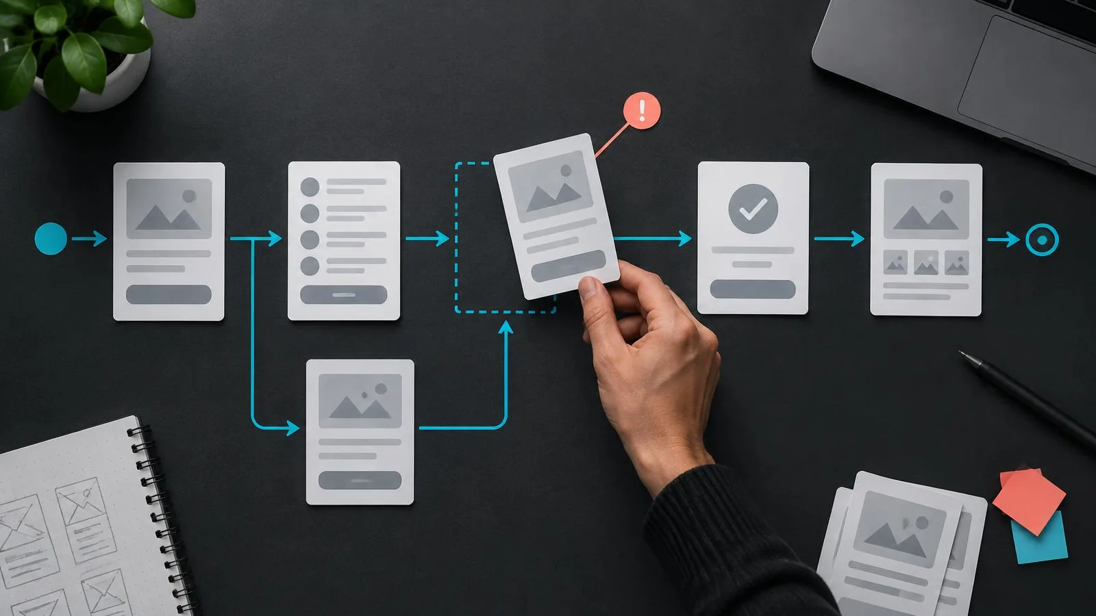
UX Design Principles That Turn Website Visitors Into Customers
A practical guide to reviewing the small interactions and information choices that make a website easier to use—and easier to act on.
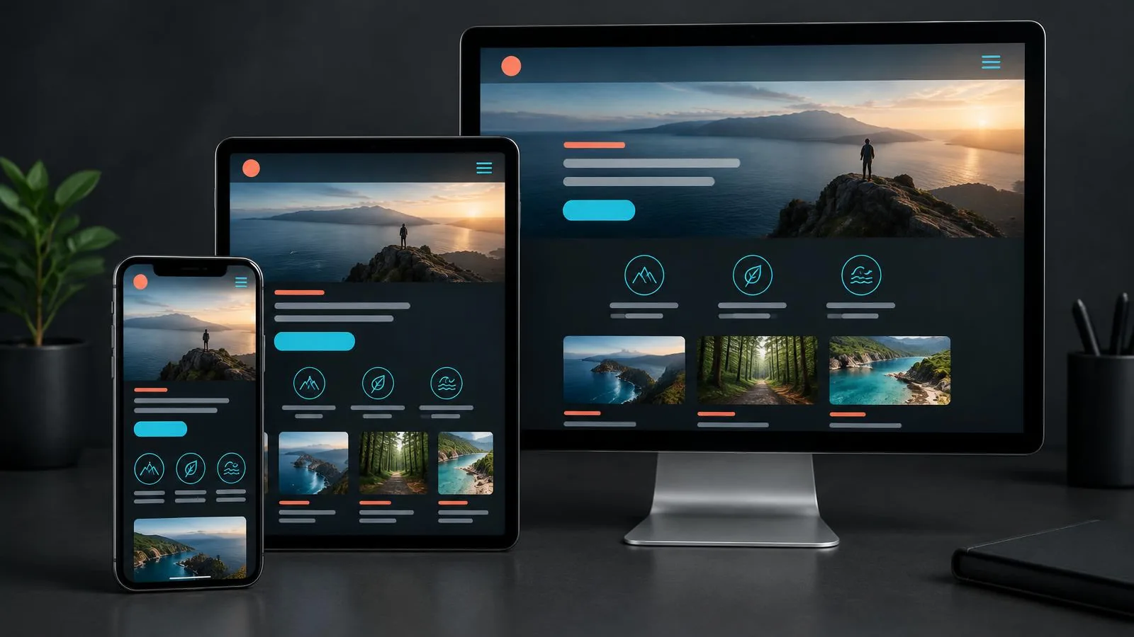
Mobile-First Web Design: Why Your Business Website Must Work on Every Screen
A practical planning approach for designing around constrained screens and real tasks, then expanding thoughtfully for larger devices.
How to Build a High-Converting Business Website in 2026
Most business websites look fine and convert poorly. Here is the structure, messaging and technical foundation behind websites that actually generate enquiries.